3 Important Lessons about Website Design
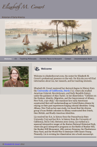
On Sunday February 16, 2014, I launched my new website. The site took about 6 months to create: 3 months of thinking and research and 3 months of writing content, installing plug-ins, and formatting all of my old blog posts to fit my new theme. As I already had a fairly decent web presence, I built my new site on nights and weekends.
I chose to redesign my website because my old site suffered from 3 design flaws.
In this post you will learn 3 important lessons about website design.
 Lesson 1: Design a Website, Not a Blog
As much as I loved my old website, it looked and felt like a blog, not a website.
It looked and felt like a blog because of the haphazard way I designed it.
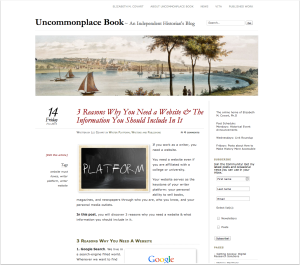
I created my old website in late 2011/early 2012 as a blog. I had a separate personal website on elizabethcovart.com, which I created with Sandvox.
Having two websites proved problematic.
First, I had to maintain two websites on two different platforms.
Second, I had two online hubs, when I should have had one.
Neither site served me well on its own.
I learned rather quickly that I did not want to maintain two websites. I also learned that if I wanted to make it as an independent historian and writer, I needed to have a real online hub that showcased all of my writing in one place.
As I loved the clean look of my blog and the functionality of WordPress, I copied the “About Me” information from elizabethcovart.com and added it to my blog, uncommonplacebook.com.
By choosing to merge my personal site into my blog, I had designed my website as a blog first and website second.
The emphasis of my old website always remained on my blog.
 Lesson 2: The Power of URLs
About a year after I merged my websites, I recognized that my decision to fold my personal website (elizabethcovart.com) into my blog website (uncommonplacebook.com) had a major flaw: I had unintentionally made Uncommonplace Book my lead brand.
All websites have one main URL.
You can use different URLs to direct people to different pages on your website, but your website resides on one URL and that URL is the one that indexes with search engines.
The main URL for my old website was uncommonplacebook.com, not elizabethcovart.com.
As a writer, your lead brand should be the name you publish under. Your name makes it easy for potential readers and media outlets to find you.
 By making uncommonplacebook.com my main URL, I likely confused people.
Anyone who used a search engine to find me by name found uncommonplacebook.com. Potential readers and media outlets had to navigate my website to find out who I was, what I write about, and whether they had found my website.
In our fast-paced, mobile world, you want to make it as easy and as fast as possible for people to find and recognize you and your content.
My new website uses elizabethcovart.com as its main URL and uncommonplacebook.com to point to my blog.
It also looks like a website.
My new website emphasizes Elizabeth M. Covart, Historian & Writer. Uncommonplace Book, Missing Advisor Consulting, and all of the other content on my site is secondary to me and my writing.
Reason 3: Responsive Design
Speaking of the fast-paced, mobile world we live in, did you know that 55% of American adults use a smartphone? Or that 42% of American adults surf the internet with a tablet device?*
My old website did not play nice with mobile devices.
I want my blog and published writing to succeed in our crowded, noisy social world. Therefore, I redesigned my blog with a "responsive design" WordPress theme.
Responsive design means my website will adapt to whatever device people use to browse the internet. My website will look great on a smartphone, tablet, laptop screen, monitor, or TV screen.
Conclusion
When you design your website make sure you design it as a website (not a blog), that you use your writer website URL as your main URL, and that you use a WordPress theme or website design platform that allows you to create a site that will adapt to any screen size.
 Questions?
If you have a question about my website design or how I created any of the elements on my website, leave a comment, send an e-mail, or tweet me.
Did You Know?
Did you know that I am experimenting with posts on Tuesdays and Thursdays?
Sign-up for my mailing list so you never miss a post.
As a subscriber you will receive one e-mail each Friday with a roundup of the week’s posts.
*Pew Research Internet Project, “Mobile Technology Fact Sheet,” December 27, 2013. http://www.pewinternet.org/fact-sheets/mobile-technology-fact-sheet/