websites

Professional Website, v. 4.0

Professional Website, v. 4.0

A tour of the fourth iteration of my professional website.

Welcome to my new website! 

A website represents your home on the web. It’s where people come to learn more information about you and where you have the opportunity to convey the image and message you want to the world.

I really loved my old website, but I needed a change. It felt dated (it was three and half years old) and as the third iteration of my original website, it no longer conveyed the image and message I want to convey to the world.

How to Build Your Historian’s Website & Where to Build It, Part 1

How to Build Your WebsiteYou know you need to build your platform and you have decided to start with a website, but how and where do you build your historian’s website? If you don’t know how to write HTML and CSS code, creating a website may seem daunting, but it shouldn’t be.

There are several low and premium cost options available for those who don’t know how to code in a computer language.

In this post you will discover three options you could use to build your historian’s website.

Part 2 of this post will cover WordPress and where I think you should build your website.


bloggerlogoBlogger

Overview

Blogger is a free weblog publishing tool provided by Google.

Blogger offers the ability to create a blog and to add webpages that highlight who you are, your CV, books/writing/research, teaching, news, and services that you offer.

Features

Themes: Blogger offers a selection of themes (background designs) that you can use to customize your website.

If you have the know-how, you can customize any blogger theme by adjusting the HTML and Cascading Style Sheet (CSS) code.

Blogger also offers users several “dynamic” designs to choose from.

“Dynamic” or responsive themes automatically scale to a viewer’s device. If you pick one of Blogger's “dynamic" themes your website will look good on giant monitors, laptop screens, and mobile devices such as tablets and smartphones.


Social Sharing: As a Google product, Blogger websites work seamlessly with Google+. This integration makes it easy for your to share your blog posts on Google+.


Monetization: Blogger sites easily connect with the Google AdSense revenue generation platform. This opt-in service will allow you to add advertisements to your website. If someone clicks on one of your ads you will earn a percentage of the rate Google charges the advertiser.


Mobile: Blogger has both Android and iOS apps that you can use to post to your blog and tweak your webpages while you are on the go.


Cost: Free, unless you want to purchase a custom URL or domain name. (Highly Recommended)


Summary

Blogger provides a wonderful option for those with very limited budgets. Purchasing a custom domain name from Google will be the only investment you need to make with Blogger (about $12).

Some historians have done well by hosting their blogs and websites on Blogger.  John Fea and J.L. Bell serve as two examples.

If you want to use Blogger to create a website instead of a blog, you should adjust your settings to direct web traffic to a welcome or landing page. If you don’t, those who search for you on the web will be directed to the blog portion of your site.  See Inside Tech Tricks, "How to Create a Custom Landing Page in Blogger to Increase Leads."


squarespaceSquarespace

Overview

Squarespace is a content management system that provides a website builder, blogging platform, and hosting service.

Squarespace provides a suite of drag-and-drop tools that will help you build anything from a basic website and blog to an e-commerce store.


Features

Themes: All Squarespace themes are responsive. This means they will automatically scale your website for different screen sizes; from giant desktop monitors or TVs to small smartphone screens.


Website Building: Drag and drop the features you want (and that Squarespace offers) into your theme layout.


Social Sharing: A built-in social share feature allows website viewers to easily share your content with all major social media networks.


Customization: Squarespace allows you to access the cascading style sheet (CSS) to customize the look of your theme.


Costs: Squarespace offers 3 plans:

1. Personal: for $8 per month you get to create one website with up to 20 pages, a blog, 2GB of storage space, and up to 2 contributors. You also receive the ability to sell 1 product, accept donations, and access 24/7 customer support.

Squarespace Website2. Professional: for $16 per month you get to create one website with unlimited pages, a blog, photo galleries, and have unlimited storage space and contributors. You also get the ability to sell up to 20 products, access the developer platform (for customization), and reach out to the 24/7 Squarespace Customer Support team.

3. Business: for $24 per month you receive all of the benefits of the Professional plan plus the ability to sell an unlimited number of products, real-time carrier shipping information, label printing via ShipStation, and integrated accounting by Xero.

If you pay for your plan in one, annual installment Squarespace will give you a free custom domain name.


Summary

Squarespace seems like a great option for beginners who aren’t interested in learning WordPress.

From what I have read, Squarespace’s drag-and-drop website builder makes website construction easy and the service offers only responsive themes. I also like that Squarespace provides its premium customer support to all of its clients.


DH HistorianHire a Professional Web Designer

You could hire a professional web designer to custom build the website of your dreams.

This is likely to be an expensive option, especially as you may need to retain the web designer and pay them a monthly fee to add content to your website (such as a new page or blog post), maintain your site with code updates, or to fix your website if it breaks. Additionally, you will need to pay for a hosting service to host your website and for a custom domain name.


Stay tuned for “How to Build Your Historian’s Website & Where to Build It, Part 2,” which will discuss your WordPress options. I will also reveal my thoughts as to how and where you should build your historian's website.


Share StoryShare Your Story

Do you use Blogger or Squarespace?

Have you hired a professional website designer? Please share your experiences in the comments below so we can help our colleagues make an informed decision about how and where they should build their historian’s website.


Website Design: 4 Must-Have Pages for Your Historian’s Website

Website DesignWhat content and information should you include as part of your historian’s website design?

Your website serves as the most important plank in your historian’s platform.

Your website serves as your online hub, the place people go to find out more information about you, your work, and how to get in contact with you.

For many creating a website can seem daunting, especially when it comes to what content you should include. (We will discuss how and where to create a website in a future post.)

In this post you will discover four pages that you should include in your historian’s website and four pages that you might include.


4 Must-Have Pages for Your Historian’s Website


1. Landing Page: The first page visitors see when they visit your website.
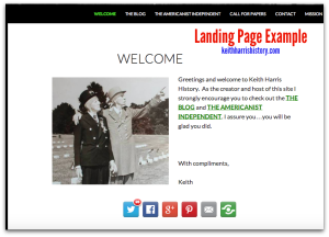
Landing Page ExampleThis page should contain a brief welcome, a succinct summary of who you are (1-3 sentences), an overview of the information and resources your website contains (i.e. list pages you want visitors to checkout such as your about page, blog, book page, and public speaking page), and a way for visitors to contact you, preferably link(s) to your e-mail address or primary social media account(s).

Landing Page Examples: Liana M. Silva, Keith Harris, Kenneth Owen.


2. About Page: The page that explains who you are.

The best about pages get to the point and do not stretch accomplishments.

They contain a professional headshot and contact links.
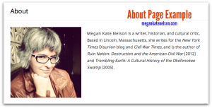
About Page ExampleSome experts recommend that you write no more than two, short paragraphs on your about page; studies reveal that people have an attention span of about 8 seconds!

You can write as many paragraphs as you like, but be as succinct as possible. Keep large chunks of text to a minimum and make the information easy for visitors to skim by adding bold section titles.

You can also add photos or embed your CV at the bottom of your page.

I opted to create a separate page for my CV. About Page ExamplesMegan Kate NelsonJarret Ruminski, Kristen D. Burton


3. Research/Writing/Book Page(s): The page(s) where historians highlight their publications.
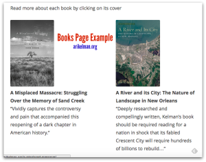
Books Page ExampleIf you have published a book, you should create a book page.

Book pages vary.

Some historians create a web page for each book.

Others offer a list of books with a photo of the cover and a brief synopsis of the book.

Book Page ExamplesChristopher Cameron and Ari Kelman


If you have not published a book, you should still create a publications or writing portfolio page.

You publication page should list your publications much like they appear on your CV, i.e. group your publications by type and introduce each type with a bolded section heading.

Some scholars also include a brief synopsis of their peer-reviewed journal articles.

When possible, include links to your publications. Publications Page Examples: Joe Adelman, Jana Remy, and Liz Covart (I offer my page because I couldn’t find another scholar who lists publications.)
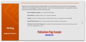
Combined Publications Page Example


Some historians like to combine their books and articles into a single publications page.

Combined Publications Page Examples: Dan Cohen and Joyce E. Chaplin


4. Contact Page: The page that makes it easy for visitors to contact you.
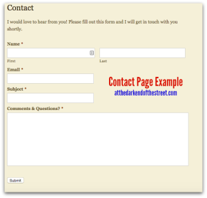
Contact Page ExampleUse this page to provide links to your e-mail address and all social media accounts that you check regularly.

You could also include your mailing address, phone number, publisher, and literary agent.

Some historians also use a contact form.

Contact Page ExamplesAndrew Pegoda and Danielle McGuire


5 Optional Pages for Your Historian’s Website

1. Blog: blogs provide a fantastic medium to broadcast your ideas.

If you have a blog you should either keep the blog on your historian's website or provide a link from your historian's website to your blog.

If you have a blog, make sure you update it with some regularity.


OnlineHub2. Press/Media/News Page: This page lists information about your appearances in the press, public speaking engagements, or other positive news about you and your work.


3. Resources: Resource pages provide helpful information to your website's visitors. They also serve to draw visitors to your website.

The resources you offer could be as simple as a linked list of your favorite blogs, how-to resources, or useful articles.

Other ideas include social media hashtag lists specific to your subfield, links to your favorite online databases, or favorite books.


4. Teaching: If you teach history, consider creating a page that lists and describes the courses you teach or have taught.

Provide links to your syllabi whenever possible and consider offering a paragraph or two about your teaching philosophy.


Teaching Page Examples: Joseph M. Adelman offers 4 pages about his teaching: an overview, a blogging rubric, his work at Framingham State University, and the classes he taught at Johns Hopkins University.

John Fea has a page that links to his "Virtual Office Hours" YouTube videos.

Roy Rogers provides a page that lists the courses he has taught and links to individual webpages with information about each course.


5. Services: Do you provide a professional service such as writing, editing, research, or consulting?

Create a page that explains and offers your professional skills for hire.


Share StoryShare Your Story

What pages do you have on your historian’s website?

What questions do you have about how to create a website?


3 Important Lessons about Website Design

On Sunday February 16, 2014, I launched my new website. The site took about 6 months to create: 3 months of thinking and research and 3 months of writing content, installing plug-ins, and formatting all of my old blog posts to fit my new theme. As I already had a fairly decent web presence, I built my new site on nights and weekends.

I chose to redesign my website because my old site suffered from 3 design flaws.

In this post you will learn 3 important lessons about website design.


Version 1.0 of my websiteLesson 1: Design a Website, Not a Blog

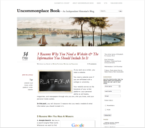
As much as I loved my old website, it looked and felt like a blog, not a website.

It looked and felt like a blog because of the haphazard way I designed it.

I created my old website in late 2011/early 2012 as a blog. I had a separate personal website on elizabethcovart.com, which I created with Sandvox.

Having two websites proved problematic.

First, I had to maintain two websites on two different platforms.

Second, I had two online hubs, when I should have had one.

Neither site served me well on its own.

I learned rather quickly that I did not want to maintain two websites. I also learned that if I wanted to make it as an independent historian and writer, I needed to have a real online hub that showcased all of my writing in one place.

As I loved the clean look of my blog and the functionality of WordPress, I copied the “About Me” information from elizabethcovart.com and added it to my blog, uncommonplacebook.com.

By choosing to merge my personal site into my blog, I had designed my website as a blog first and website second.

The emphasis of my old website always remained on my blog.

Uncommonplace BookLesson 2: The Power of URLs

About a year after I merged my websites, I recognized that my decision to fold my personal website (elizabethcovart.com) into my blog website (uncommonplacebook.com) had a major flaw: I had unintentionally made Uncommonplace Book my lead brand.

All websites have one main URL.

You can use different URLs to direct people to different pages on your website, but your website resides on one URL and that URL is the one that indexes with search engines.

The main URL for my old website was uncommonplacebook.com, not elizabethcovart.com.

As a writer, your lead brand should be the name you publish under. Your name makes it easy for potential readers and media outlets to find you.

personal websiteBy making uncommonplacebook.com my main URL, I likely confused people.

Anyone who used a search engine to find me by name found uncommonplacebook.com. Potential readers and media outlets had to navigate my website to find out who I was, what I write about, and whether they had found my website.

In our fast-paced, mobile world, you want to make it as easy and as fast as possible for people to find and recognize you and your content.

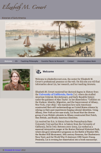
My new website uses elizabethcovart.com as its main URL and uncommonplacebook.com to point to my blog.

It also looks like a website.

My new website emphasizes Elizabeth M. Covart, Historian & Writer. Uncommonplace Book, Missing Advisor Consulting, and all of the other content on my site is secondary to me and my writing.


Reason 3: Responsive Design

Speaking of the fast-paced, mobile world we live in, did you know that 55% of American adults use a smartphone? Or that 42% of American adults surf the internet with a tablet device?*

My old website did not play nice with mobile devices.

I want my blog and published writing to succeed in our crowded, noisy social world. Therefore, I redesigned my blog with a "responsive design" WordPress theme.

Responsive design means my website will adapt to whatever device people use to browse the internet. My website will look great on a smartphone, tablet, laptop screen, monitor, or TV screen.


Conclusion

When you design your website make sure you design it as a website (not a blog), that you use your writer website URL as your main URL, and that you use a WordPress theme or website design platform that allows you to create a site that will adapt to any screen size.


Questions blackboardQuestions?

If you have a question about my website design or how I created any of the elements on my website, leave a comment, send an e-mail, or tweet me.


Did You Know?

Did you know that I am experimenting with posts on Tuesdays and Thursdays?

Sign-up for my mailing list so you never miss a post.

As a subscriber you will receive one e-mail each Friday with a roundup of the week’s posts.


*Pew Research Internet Project, “Mobile Technology Fact Sheet,” December 27, 2013. http://www.pewinternet.org/fact-sheets/mobile-technology-fact-sheet/